I have created a Prezi to show how effective the combination of my main products and ancillary text:
https://prezi.com/stxpsg2ihczg/how-effective-is-the-combination-of-your-main-product-and-ancillary-texts/#
Tuesday, 15 December 2015
How did you use new media technologies in the construction and research, planning and evaluation stages?
Below is a prezi i have made which shows what technology i used, how i used it and what issues i came across when using it:
What have you learned from your audience feedback?
Audience Feedback
To gather some audience feedback on my video i created a Survey for people to answer on the website Survey Monkey.

I asked these questions as i felt that they would help me to gather information about my Video, Poster and Digipak and also information about whether or not all the products work well together. These questions also allowed my Audience to provide me with positive and negative feedback so i know what needs improving and what doesn't need improving.


Positive feedback gained:
- The overall outcome for my video was that it all came together well and the shots worked well with the song.
- A lot of respondents said that they really liked the beginning and end scene where there is the candle being lit and then blown out. They thought it was really effective and helped to bring the whole video together as a whole
- They said that the overall video was enjoyable to watch and the editing is well timed with the song
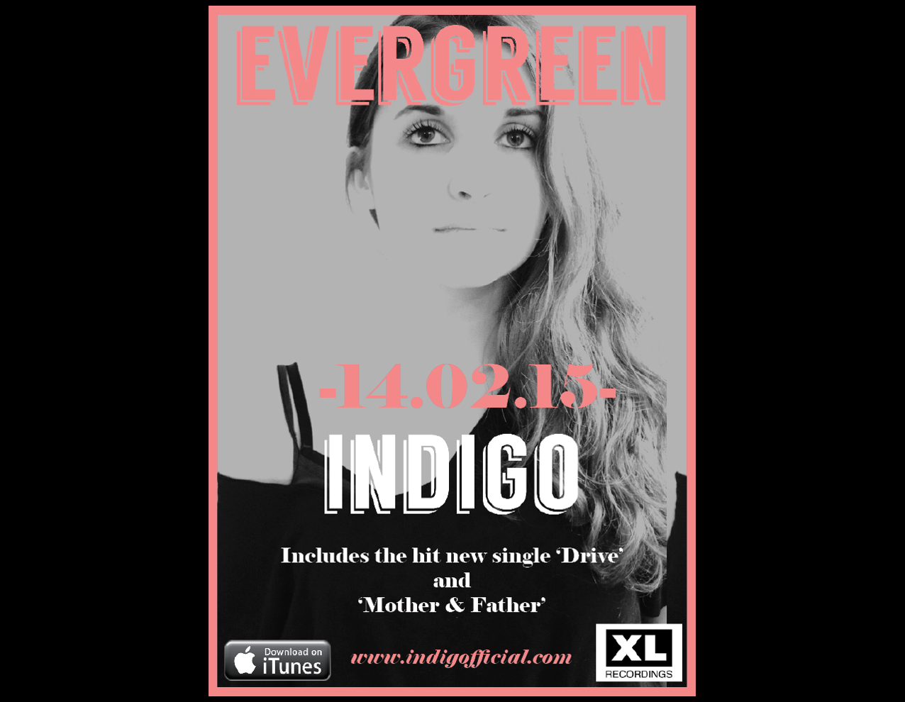
- A lot of the audience could see a clear connection between the digipak and poster due to there being a theme that runs through both of them
- Overall the felt that the poster successfully promoted the artist and video as it made them want to listen to the song more and re watch the video.
Room for Improvement:
- Although a lot of the respondents gathered that the video was about breaking apart from old memories of a relationship of some sort, they still said that the story line was a little unclear, especially at the beginning of the video. I could include more shots about why she is burning all of her memories to make it clearer.
- If i was to change anything, they said that i could include the artist singing along to the song in area of it, so that it links the video and artist more to the song.
- They also said that a change in outfits for the artist may help to keep the audiences attention more throughout.


Laura: "I love the overall look of your digipak. It is clear that you have thought through each aspect of the digipak, and spent a lot of time on it. I love how it all connects together via the use of the colours and font. You have also paid attention to a lot of smaller details, such as the barcode and the logo for the production company. I feel that it helps to bring it all together more and give it a more professional look overall!"
Aoife: " The CD that you have created is my favourite aspect of your whole digipak, as it links with the music video and on it own it looks great! I like the combination of the black and white photo with the pink and white text. It helps it to really stand out and overall, the colours work really well together. The only negative thing i can think of to say is that the picture on the front of the digipak fades into the background colour, which means that the artist isn't as visible on the front as she is on the back page."
Juliette: "Wow! The way that you have put your digipak together really draws me towards the artist and makes me want to buy the CD. The colours used help to bring each section together and make for a really effective digipak. Overall, i feel that you have put a lot of effort into it and it shows as the finished product looks very professional and i would buy it!"

Laura:" I love that i can see a clear link between the poster and the digipak. This is really effective and draws me towards the products. After watching the video and then looking at the poster, i can see a clear link due to the fact that shes wearing the same outfit within the video. I really like how they link as it means that the poster is promoting the video and the audience can clearly see the link. I like how the same font and colours are used on the poster as the digipak! Overall its really effective!"
Aoife: " The poster is just as good as the digipak! There is a really clear link between the two products and this is really effective. There is the same issue with not knowing where her body ends and where the background ends, but this doesn't massively take away from the overall look of the product."
Juliette: " The poster and Digipak combination work so well together as the theme is the same throughout and the use of the same image on the poster and digipak also helps to connect the products more. I really like how you have added the logos for iTunes and XL Recordings as it helps the overall look of the poster to be more professional."
In what ways does your media product use, develop or challenge forms and conventions of real media products?
In what ways does your media product use, develop or challenge forms and conventions of real media products?
I have create a video to show how i have used and challenged conventions of media products:


New Poster Analysis

New Digipak Analysis

Monday, 14 December 2015


Sunday, 13 December 2015


Monday, 7 December 2015

Chosen Font


Subscribe to:
Comments (Atom)